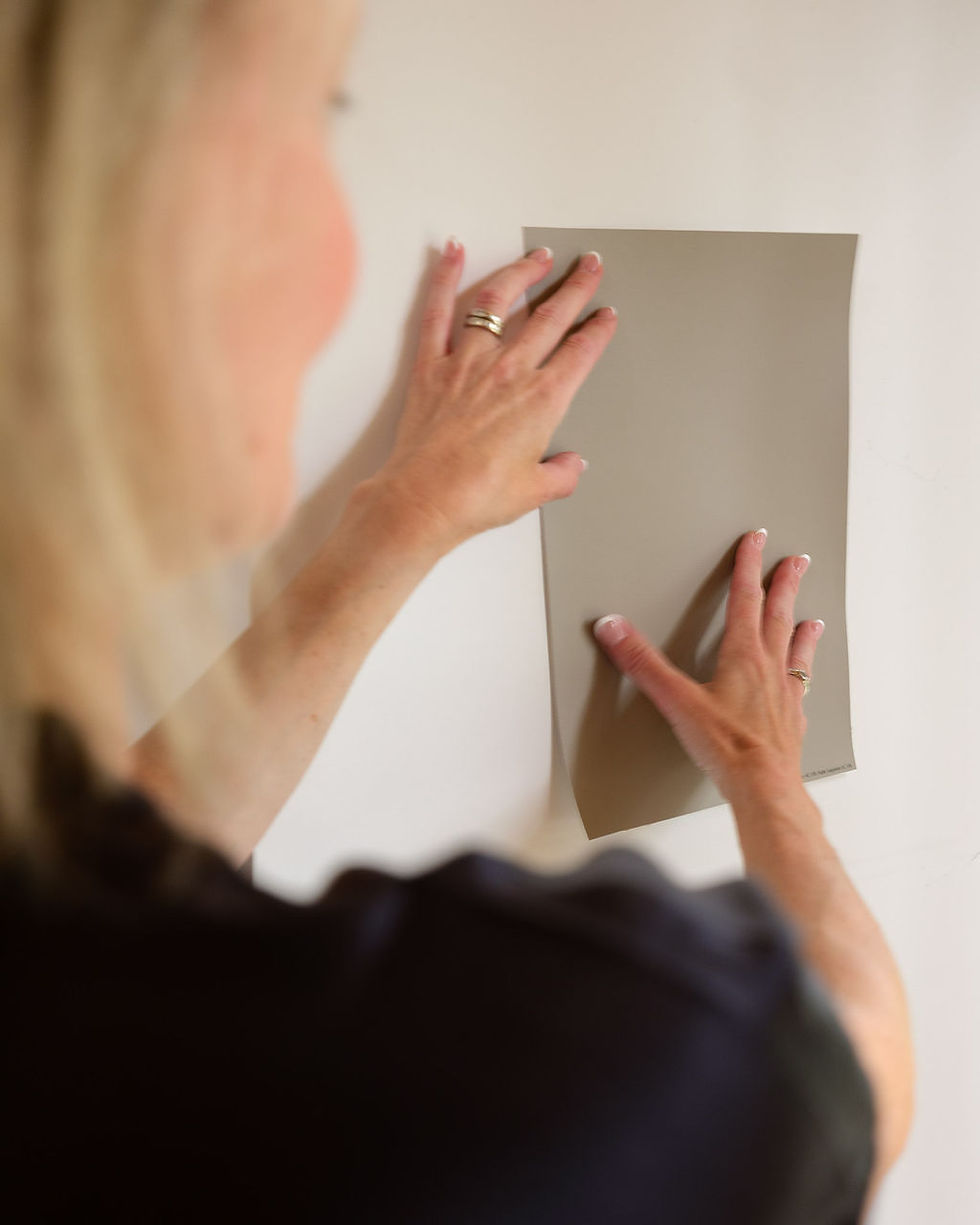
Why Does My Paint Colour Look Wrong? It's All in the Undertones

Have you ever chosen a paint colour that looked perfect on the sample chip, only to get it on your walls and wonder what happened?
The beautiful warm neutral suddenly looks pink. The soft white looks yellow. That perfect greige you saw online somehow looks purple in your living room. Often, the problem isn’t the paint colour itself.
It’s all in the undertones.
As a colour consultant based in Summerland, I often see this in homes throughout Penticton and the South Okanagan. A paint colour can be beautiful on its own but still be completely wrong for your home.
Here’s why.

What Is an Undertone?
Every colour has a dominant colour, which is the one you notice first. It also often has a more subtle underlying colour called an undertone.
Neutrals are where undertones tend to cause the most confusion. A beige may have a pink, yellow or green undertone. A grey might lean blue, green or violet. Even whites can have yellow, pink, grey, blue or green undertones.
On a tiny paint chip, those undertones can be difficult to see. Put that same colour on a large wall next to your flooring, kitchen cabinets or countertops, and suddenly the undertone can become very obvious. That’s often when I hear: “Why does this colour look completely different in my house?”
Your Paint Colour Doesn’t Exist in Isolation
One of the biggest mistakes I see homeowners make is choosing a paint colour without considering the other finishes in the room. Your flooring has an undertone. Your countertops have undertones. So do your cabinets, backsplash, tile, furniture and even wood finishes. When those undertones work together, a room feels cohesive—even if you can’t quite put your finger on why.
When they don’t, something just feels off.
For example, a lovely warm greige may look beautiful on a paint chip but unexpectedly pink once it’s next to a yellow-toned floor. A crisp white that looked fresh in the paint store may suddenly feel cold beside warm cabinetry.
This is why I don’t choose paint colours based solely on a photograph, a Pinterest image or a list of the year’s most popular colours.
I want to see the colour in your home, with your finishes and in your light.
Why Does the Same Paint Colour Look Different in Someone Else’s Home?
This is one of the biggest frustrations with choosing paint colours online.
You see a gorgeous room painted in a particular colour, buy the exact same paint and expect the same result.
But your home is different.
The direction your windows face, the amount of natural light in the room and even the time of day can change the way a colour appears. Here in the Okanagan, many homes have large windows and lots of natural light. That beautiful sunshine can dramatically affect how a colour reads throughout the day.
Then there are the finishes already in your home. The same paint colour next to white oak flooring will look completely different beside warm maple cabinetry, beige tile or a cool grey countertop. That’s why there really isn’t one “perfect” white, beige, grey or greige that works in every home.
Why Is My Grey Paint Looking Blue or Purple?
Grey can be particularly tricky. Many greys have blue, green or violet undertones. You might barely notice them on a small paint chip, but once that colour covers four walls, the undertone can become much more obvious. This is also one reason some homeowners have become frustrated with grey.
Grey itself isn’t necessarily the problem.
The right grey can still be beautiful. The key is choosing one with an undertone that relates to the other colours and materials in the room rather than choosing grey simply because it seems like a safe neutral.
Why Does My White Paint Look Yellow?
White might be the most deceptively difficult paint colour of all. There are warm whites, cool whites, creamy whites, greyed whites and whites with subtle green, pink or yellow undertones.
Put a warm white beside a cooler white countertop and it may suddenly look yellow. Choose a very crisp white in a room filled with warm finishes and it can feel stark rather than fresh.
Even popular colours such as Benjamin Moore White Dove can look different from one home to another. There’s nothing wrong with the colour. It simply needs to work with the permanent finishes already in your home.
Lighting Changes Everything
Colour isn’t static. The colour you see at 9 a.m. may not be exactly what you see at 5 p.m. Natural light changes throughout the day, and artificial lighting introduces another variable. Even the colour temperature of your light bulbs can make a paint colour appear warmer or cooler.
That’s why I always recommend looking at paint samples in several areas of the room and checking them at different times of day. And don’t rely on your phone screen. Online images are wonderful for inspiration, but digital colour isn’t accurate enough to make a final paint decision.
Start With the Things You Can’t Easily Change
If you’re renovating or updating several finishes in your home, paint usually shouldn’t be your first decision. Paint comes in thousands of colours. Flooring, countertops, cabinetry and tile offer far fewer choices and they’re considerably more expensive to replace if you get them wrong. I prefer to establish the fixed finishes first and then find a paint colour that connects everything.
It’s much easier to find the right paint colour for your flooring than it is to find the right flooring for a paint colour you’ve already committed to.
Look at Your Samples Together
You might love your flooring sample. You might love the countertop. And you might love the cabinet colour. But do they work together? This is where undertones become especially important.
When I’m helping a client select finishes, I look at the samples together rather than making each decision independently. A beautiful individual selection isn’t necessarily the right selection for the overall palette. This is particularly important in open-concept homes where the kitchen, dining and living spaces are all visible at once. Everything doesn’t need to match, it just needs to relate.
Popular Paint Colours Aren’t Foolproof
There are many paint colours I return to because they’re beautiful and versatile. Benjamin Moore Classic Gray, Ballet White and White Dove, for example, can all be wonderful choices, but I don’t believe there is a universal “best” paint colour.
I’ve seen the same colour look perfect in one home and completely wrong in another.
The name on the paint chip matters much less than how that colour relates to the flooring, cabinetry, countertops, furniture and light around it.
That’s also why I’m cautious when someone tells me, “My friend used this colour and I love it.” You may love it in her house, but that doesn’t necessarily mean you’ll love it in yours.
When a Colour Consultation Can Help
Sometimes clients call me after they’ve spent weeks looking at paint chips and are completely overwhelmed. Other times, they’ve already painted a room and know immediately that something isn’t right.
A professional colour consultation can be especially helpful if you’re choosing a whole-home colour, trying to find the right white or neutral, coordinating paint with existing flooring or cabinetry, updating an older home, or trying to make new finishes work with things you plan to keep.
During an in-home consultation, I look at the space as a whole—your natural and artificial light, flooring, countertops, cabinetry, furnishings and the way one room flows into the next.
The goal isn’t simply to choose a beautiful paint colour, the goal is to choose the right colour for your home.
Colour Consulting in the South Okanagan
Julie Walters Interiors is based in Summerland, BC, and I provide in-home colour consultations in Summerland, Penticton and surrounding South Okanagan communities.
Whether you’re repainting one room, choosing colours throughout your home or making larger design and finish decisions during a renovation, I can help you narrow down the options and create a palette that works with your home.
Because when a room isn’t quite coming together, the answer isn’t always another paint sample. Sometimes, it’s all in the undertones.